
Founding Product Designer · AI · 0→1 · Mobile · 09/2025 – now
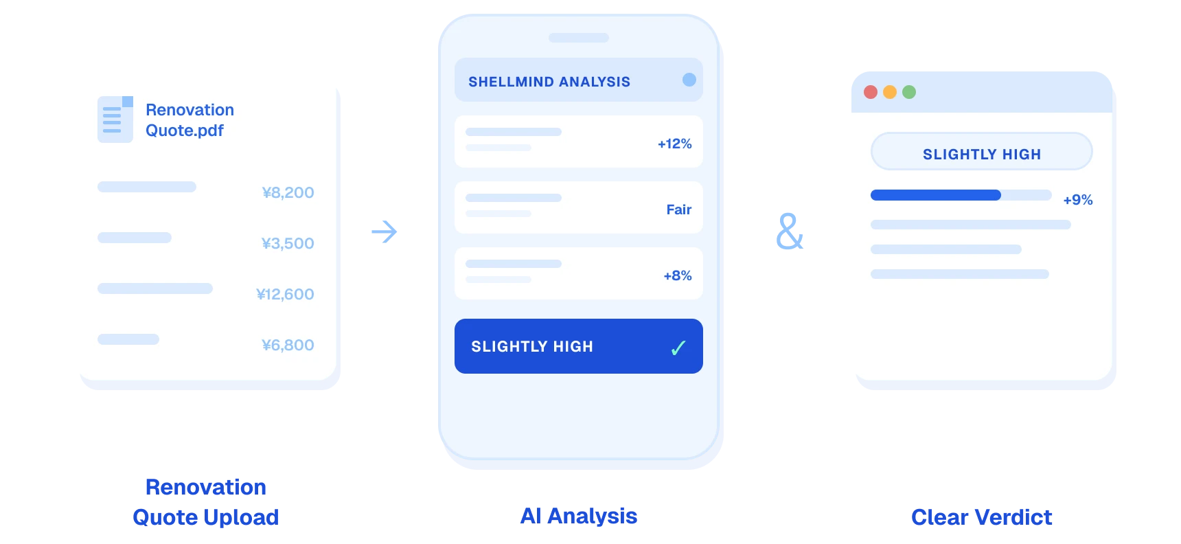
Shellmind is an AI advisor for first-time home renovators. You upload a contractor's quote; it checks prices, specs and hidden risks, and tells you what to do about them. I'm the founding, and only, product designer.
This is the story of V2. V1's AI was right, and 60% of people still left without a decision. Producing an analysis and helping someone decide turned out to be two different jobs.
Drop-off before acting fell from about 60% to about 30%.
What an expert friend used to do over an evening.
Contributed to a $700K seed round.
Where I started
I bet that showing more AI detail would earn more trust. I was wrong.
No product, no process when I joined. I picked the one question that could change our direction: does showing more of the AI's work make people trust it more?
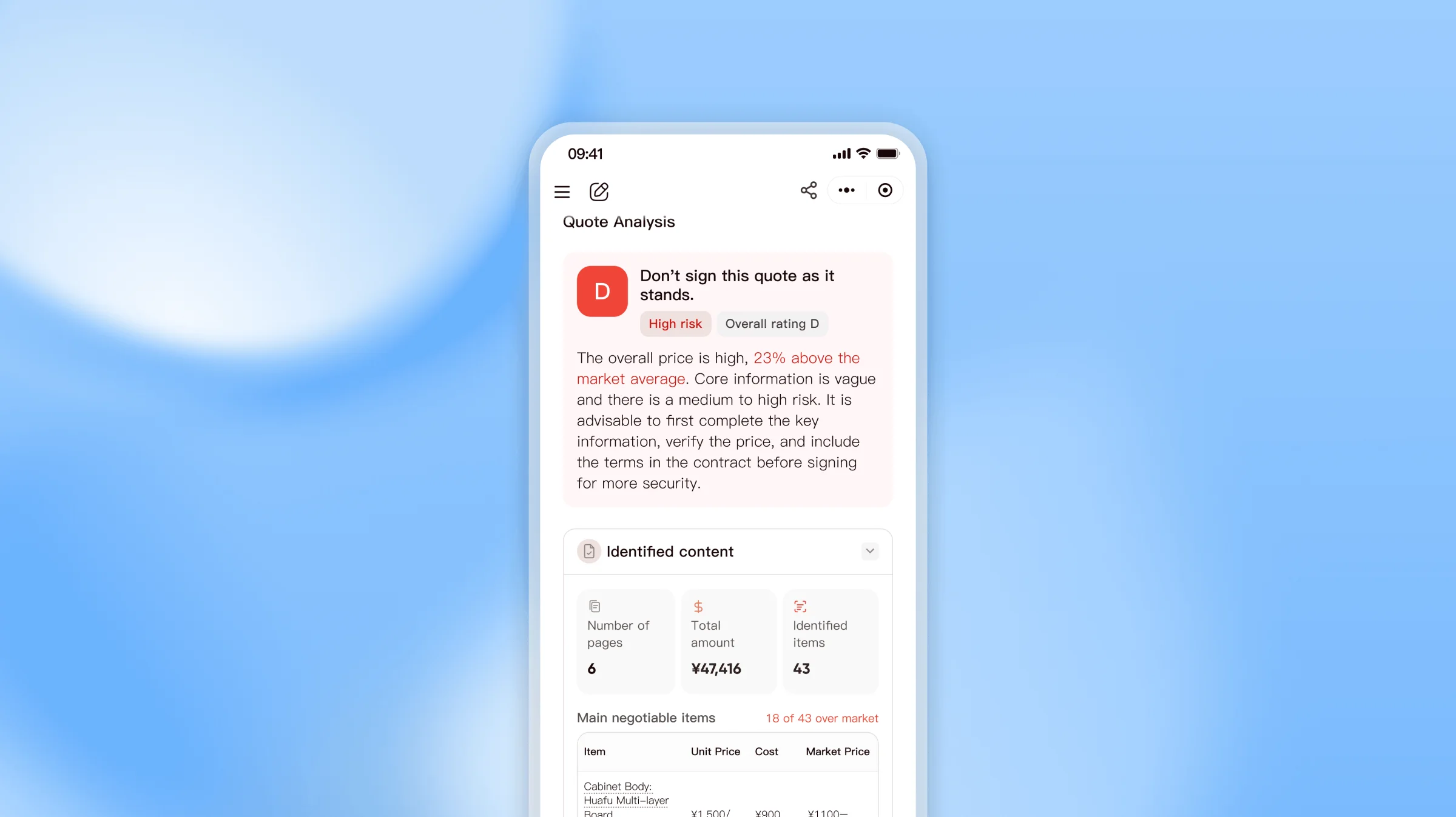
I thought yes. V1 put the full analysis on display for about 200 beta users — and the answer came back no. That wrong bet is where V2 starts.
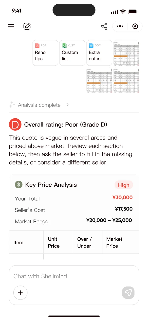
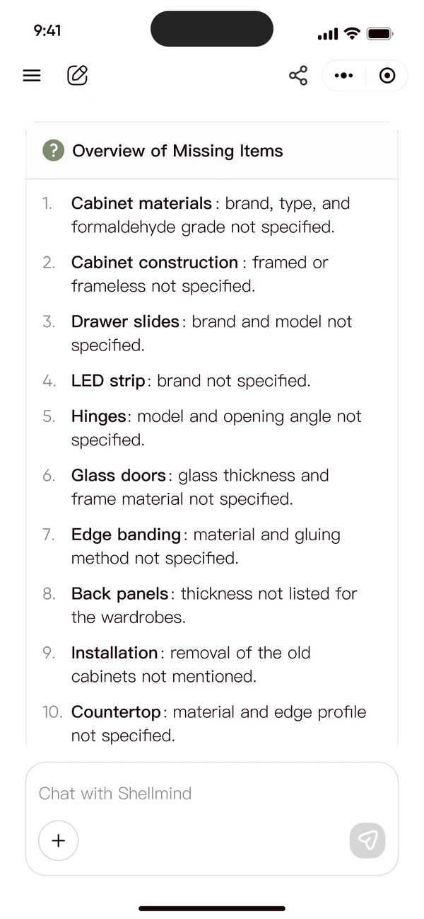
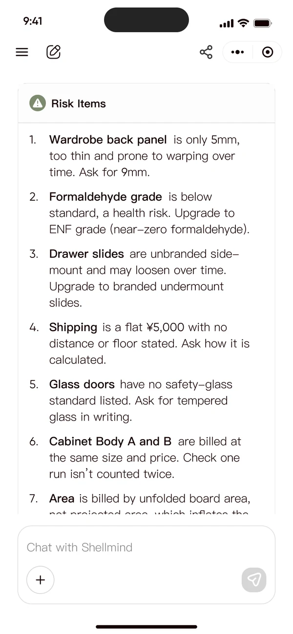
V1, the "show everything" bet, as 200 beta users saw it.
01 · Research
The AI was right. 60% still left without a decision.
The baseline
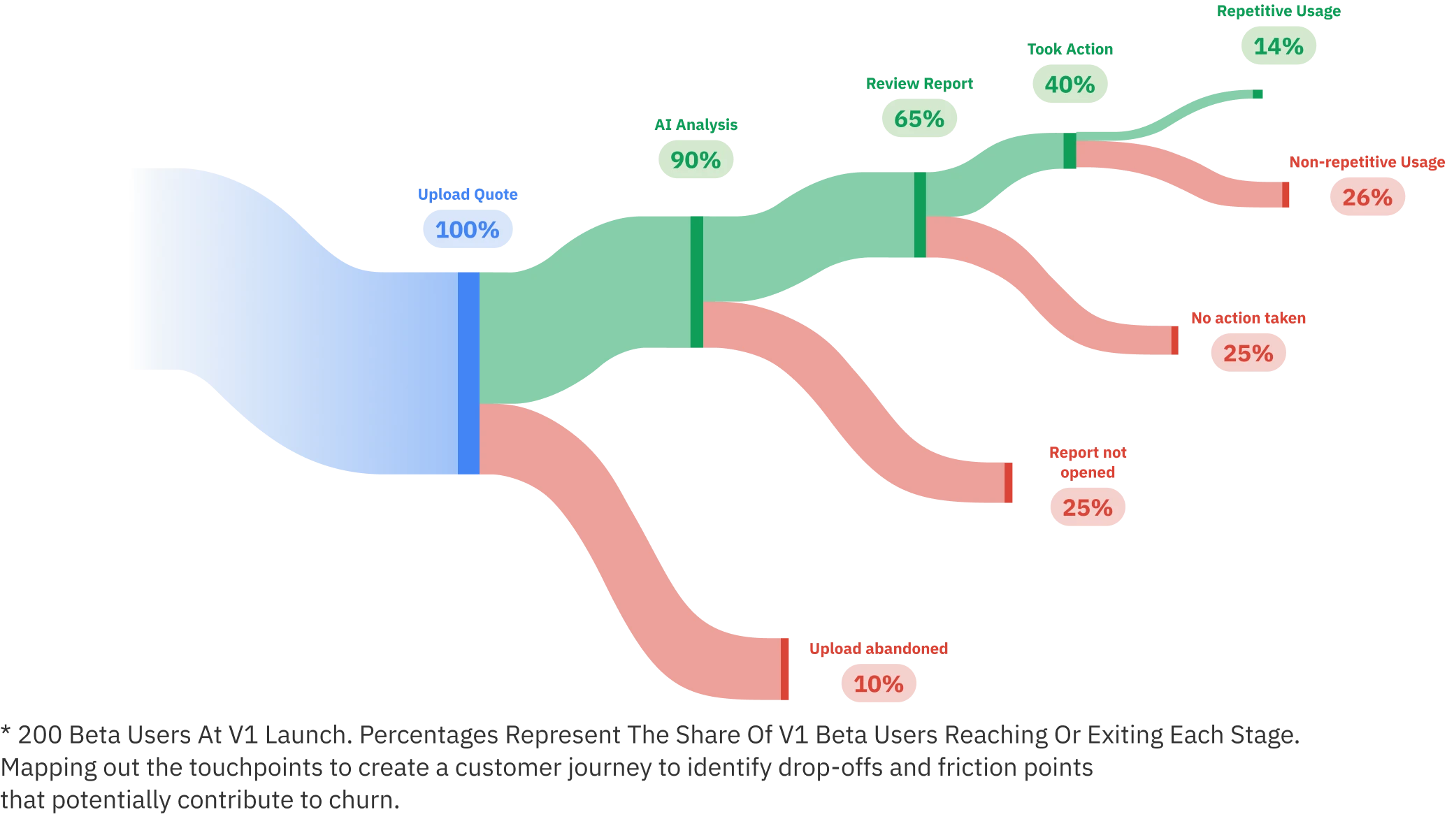
Only 40% took any action
Mobile V1, a beta with about 200 invited users. The analysis was complete and mostly correct; 90% got through it, 65% opened the report, 40% acted.
So the goal wasn't a better report. It was getting a first-time homeowner from a quote to a confident next sentence: a question to ask, or a number to push for.
Method
12 think-alouds, one honest question
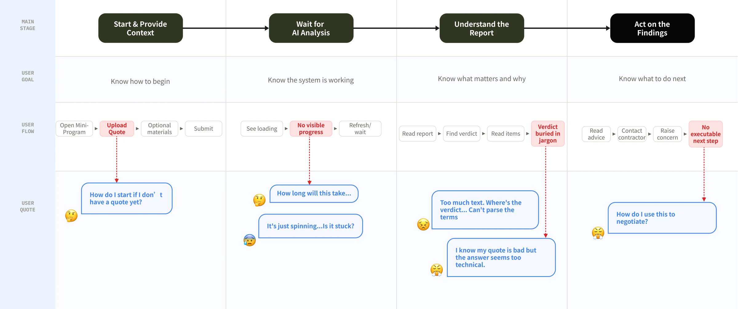
"Is this clear?" gets a polite yes. "What will you ask him?" shows whether the analysis has become the person's own judgment. Confidence broke at every handoff, not only in the report.
/02Wait
"It's just spinning… is it stuck?""Almost done" for a minute or two, and no word on whether leaving was safe.
/03Report
"Too much text. Where's the verdict?"A grade, then long tables in jargon, all with equal weight.
/04Act
"How do I use this to negotiate?"It ended on three generic questions. Nothing said what to ask for.
02 · Reframe
The unit wasn't the report. It was the decision.
One test at every stage: after this screen, can the person reach the next one on their own? One redesign became four stages.
/01Start
V1 assumed you arrived with a quote in hand.Upload stays the hero; a chat catches everyone else.
/02Wait
A full-screen "Almost done", for minutes.The wait lives in the chat — free to leave.
/03Report
Everything the AI found, in the AI's order.Keep everything, reorganise around the decision.
/04Act
V1 ended on three generic questions.Not advice — the actual words to send.
/01Start
From a tool page to an advisor
"How do I start if I don't have a quote yet?"
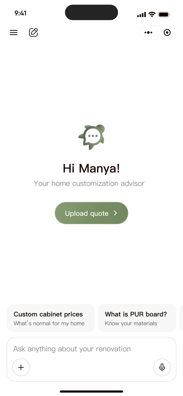
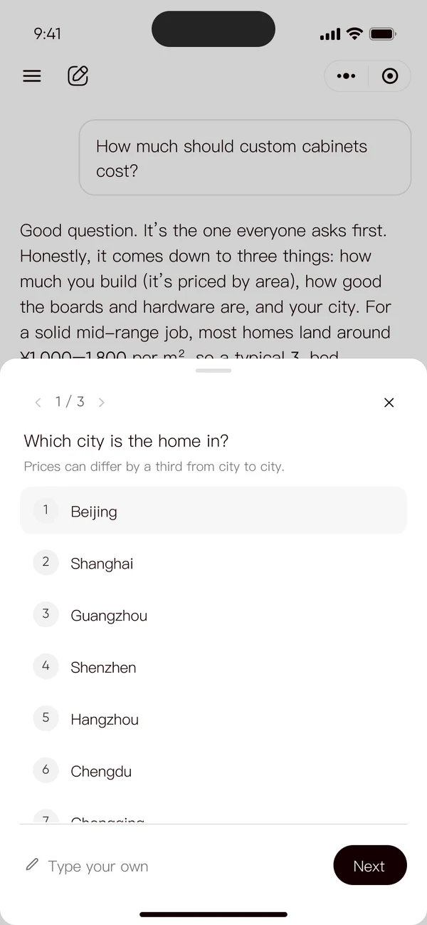
Upload stays the hero. An always-on chat catches everyone else. It answers first, asks only what changes the advice, and saves your profile visibly.
What it cost: AI spend on chats that never become an upload. Contained — every chat keeps a way back: "I got a quote".
Two doors, one analysis.
Home · upload stays the hero
Upload · try a sample
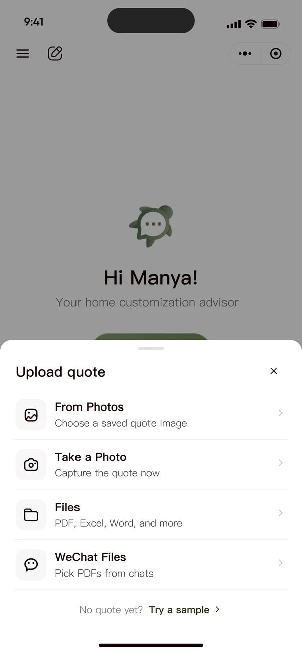
Add info · the chats quotes leave out
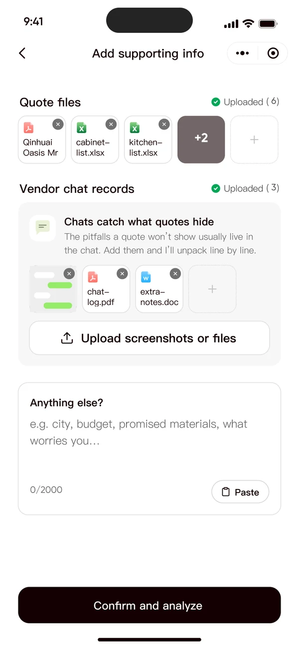
Then ask · three quick taps
The whole flow · recorded
/02Wait
From "is it working?" to "you can leave"
"It's just spinning… is it stuck?"
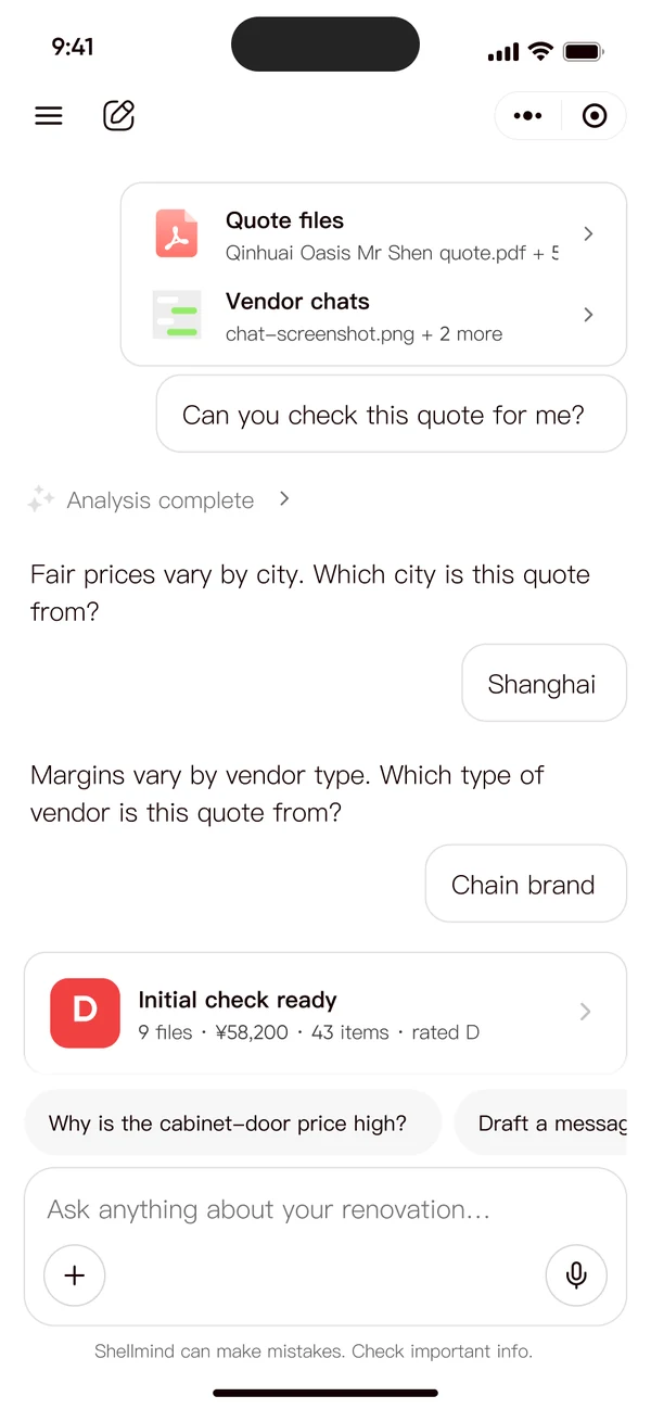
The wait lives in the chat, as a status card. Steps, time left, "you're free to leave" — and it asks only what changes the verdict, mid-check.
What it cost: the check pauses to ask, and a card can scroll away. Contained — progress saved, status in the header even folded, answers editable later.
V1 · "Almost done", full screen
Explored A · task dashboard
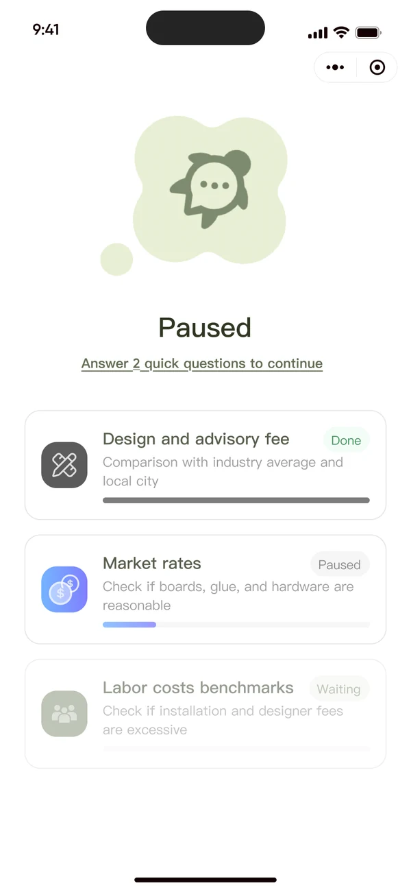
Explored B · card stack
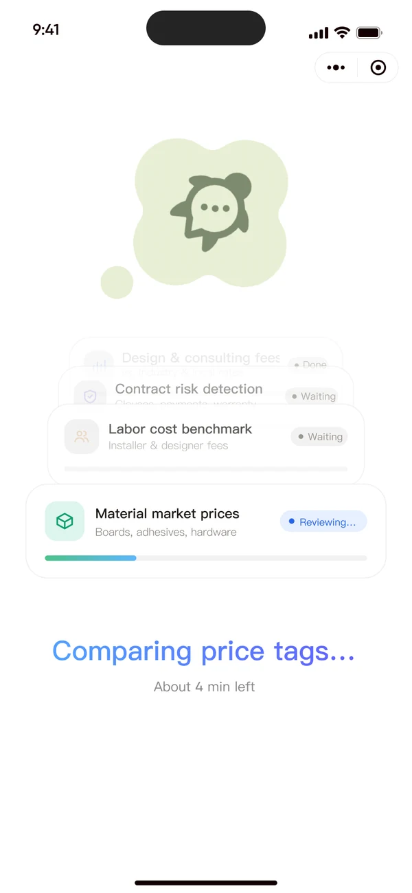
Both full-screen options hold you hostage. That's why the wait moved into the chat.
Running · in the conversation
Done · folded into the thread
Asked mid-check · which total is right
Editable later · re-prices in seconds
Ask only what changes the verdict, when it matters — and the answers stay editable.
/03Report
From everything the AI found to what you should do
"I read the whole thing, but I still didn't know what to do."
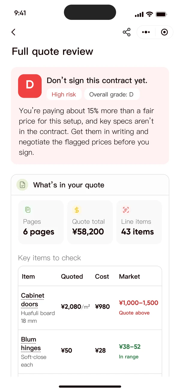
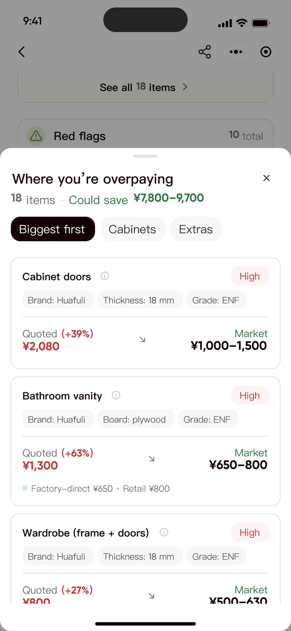
Keep everything. Reorganise it around the decision. Verdict, then the price to aim for, then what's worth arguing about. That changed the AI's output rules, not just the layout.
What it cost: evidence sits one tap down. Contained — every verdict carries its reason, and every expand row says how much is behind it.
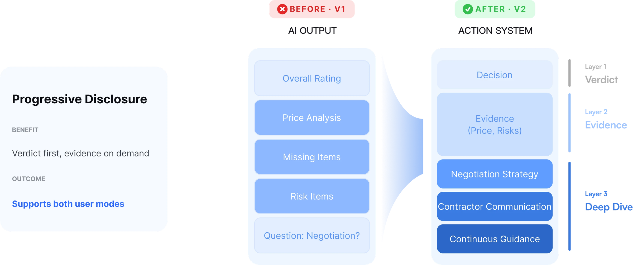
Six flat sections become three layers: decision, evidence, deep dive.
Verdict first · with its reason
Price guidance · recorded scroll
Worth arguing · biggest first
 V1V2
V1V2
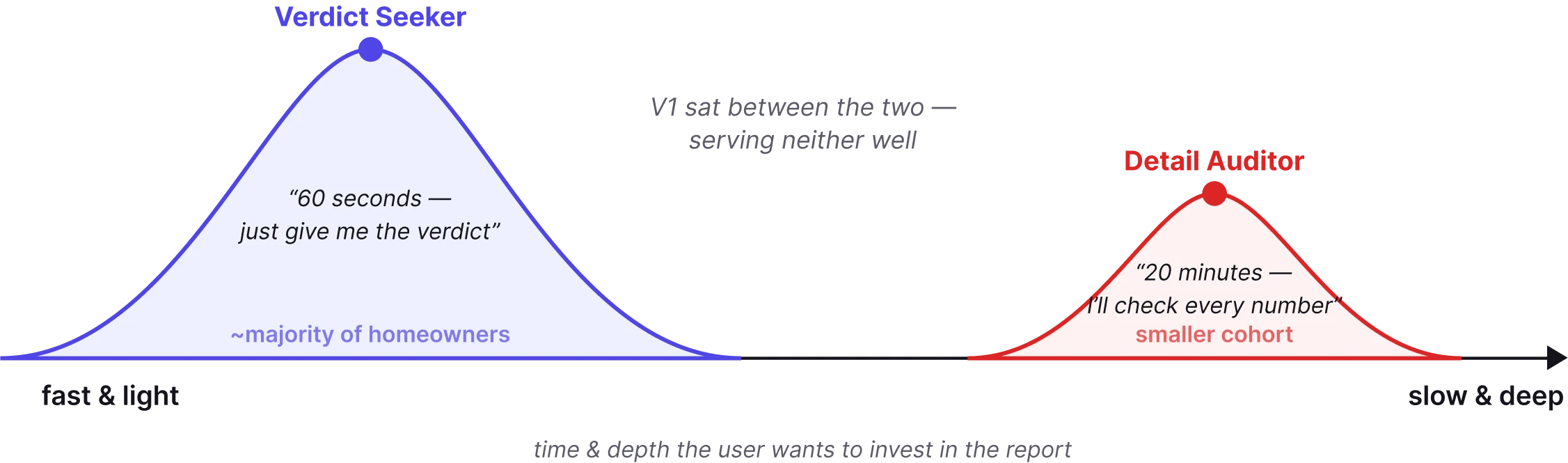
Two reading modes. Cutting fails the auditors; V1's tables failed the seekers. Reorganising serves both.
/04Act
Don't just read the report. Know what to say next.
"How do I use this to negotiate?"
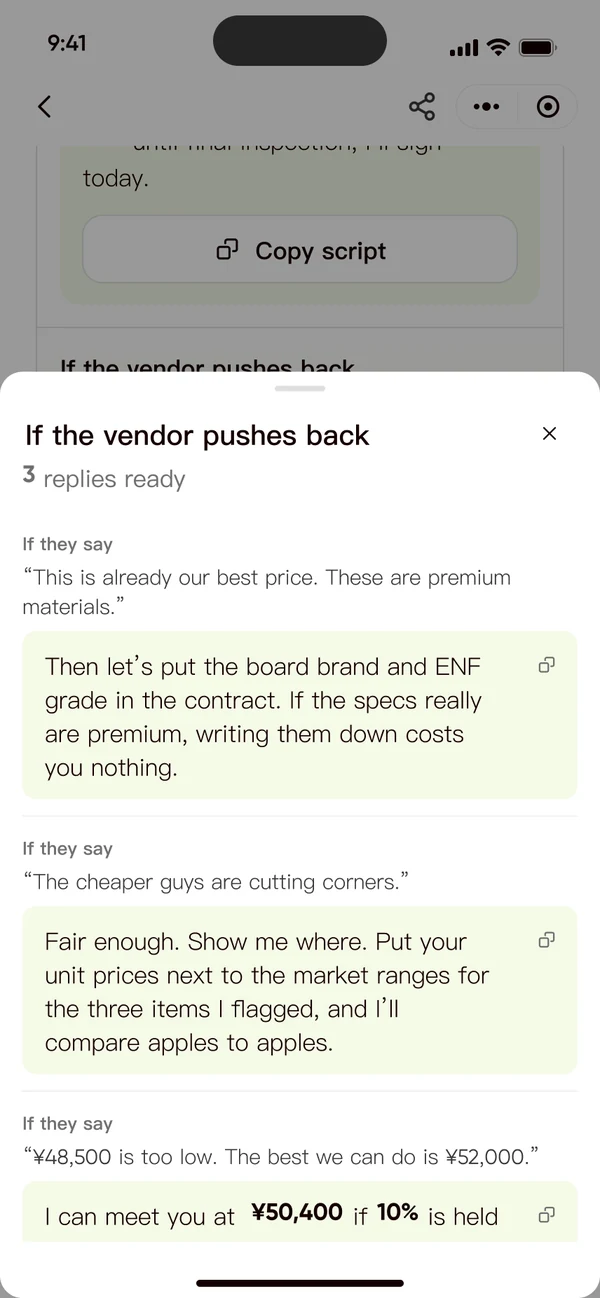
Not advice. The actual words. An opening offer, an "Ask for" line on every red flag, and a script written to be sent as-is.
What it cost: the AI now speaks for the person. Contained — numbers come as ranges, the reason sits beside every line, and scripts are copied, never sent for you.
Red flags · most serious first
What to say · opening offer + script
If they push back · three ready replies
The math · as a sheet
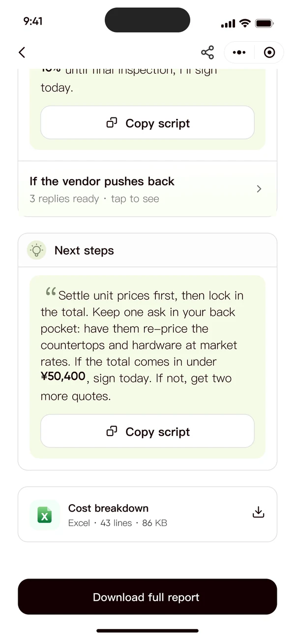
V1 ended with a download button — V2 ends with the user's next sentence, and replies for when the vendor pushes back.
03 · System
When the system isn't sure, it says so, and never loses your work
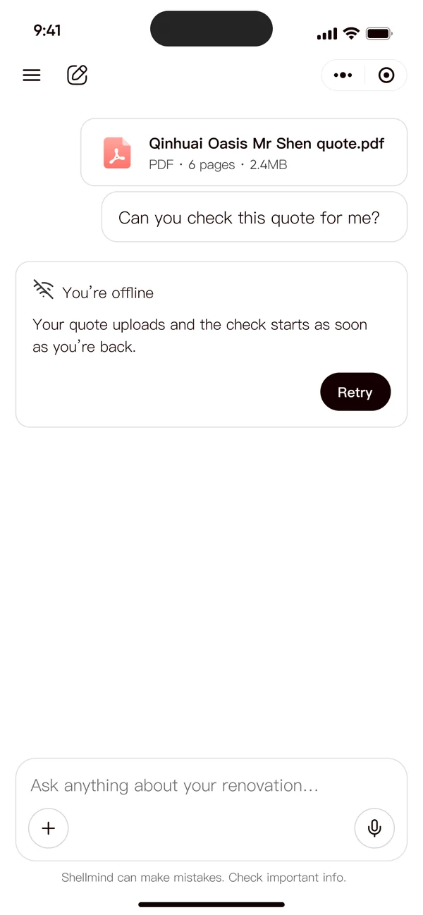 Offline
Said once, in the reply. One Retry.
Recoverable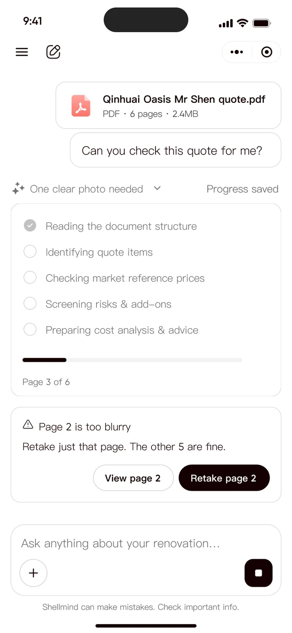 Page too blurry
One clear photo, never a re-upload.
Trustworthy data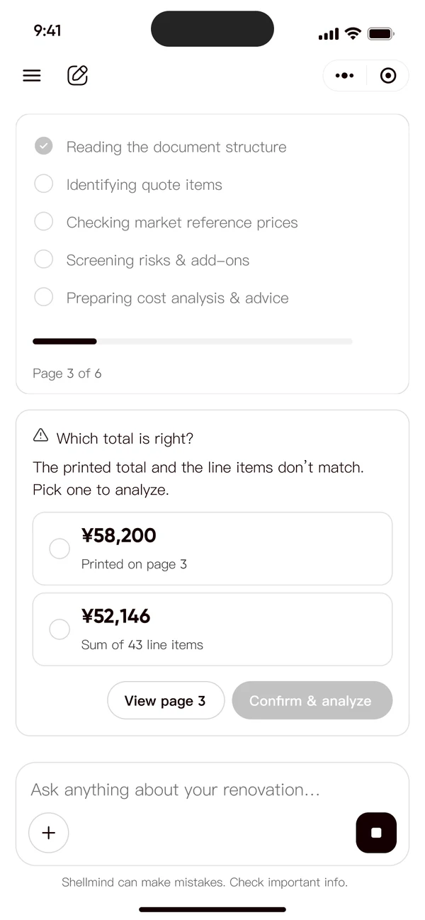 Total doesn't add up
Nothing concluded from unconfirmed data.
Trustworthy data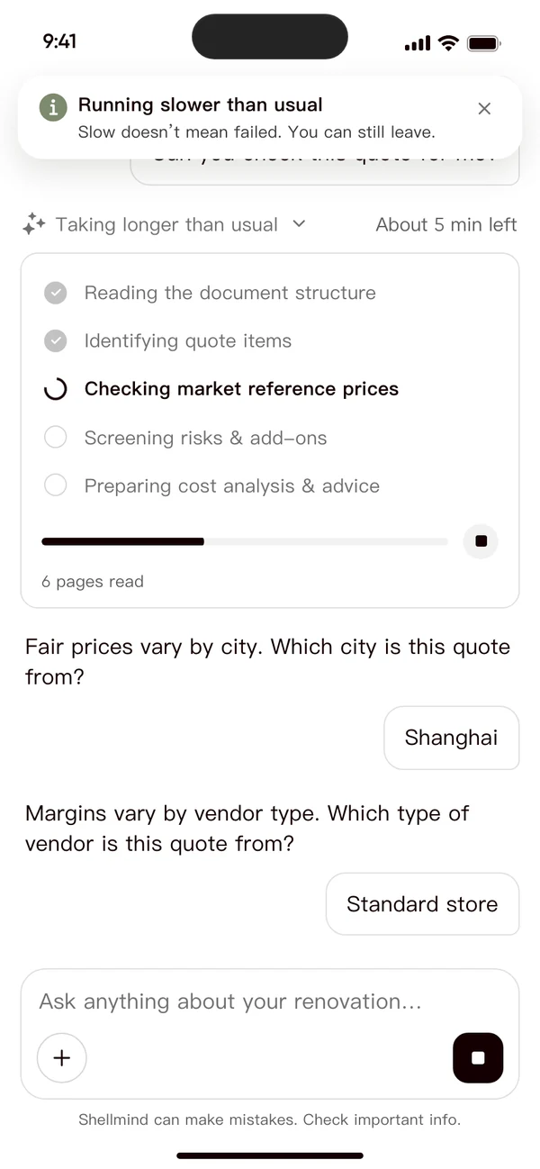 Slow analysis
Slow isn't failed. Leaving is safe.
Honest status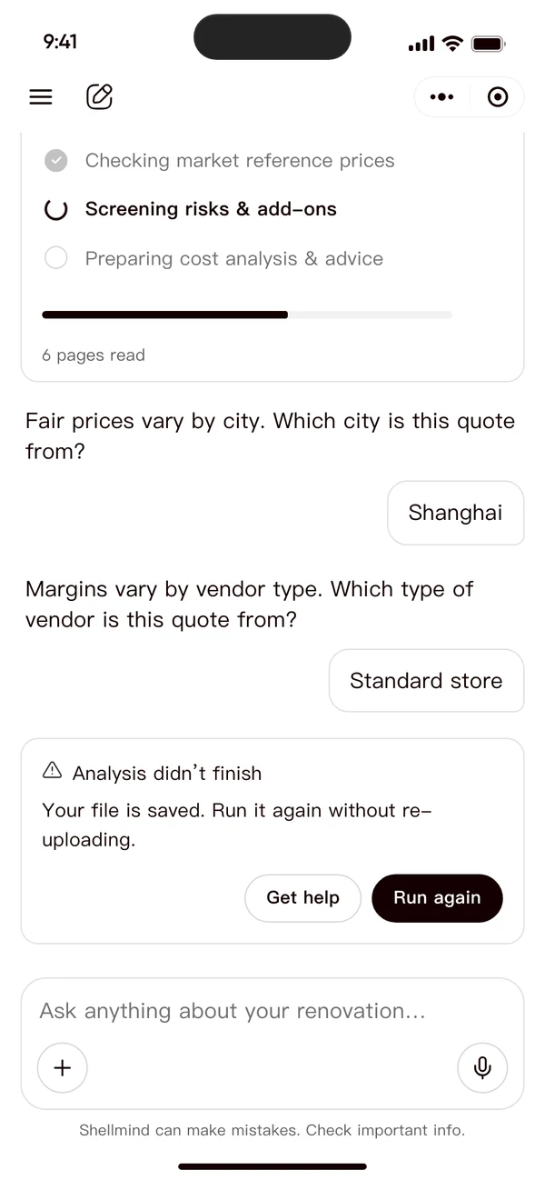 Analysis failed
File saved. Run again, no re-upload.
Recoverable04 · From design to build
Figma is the single source of truth
Tokens and screens live in Figma; behaviour ships as coded pages engineers can click. Scroll — or run each one live.
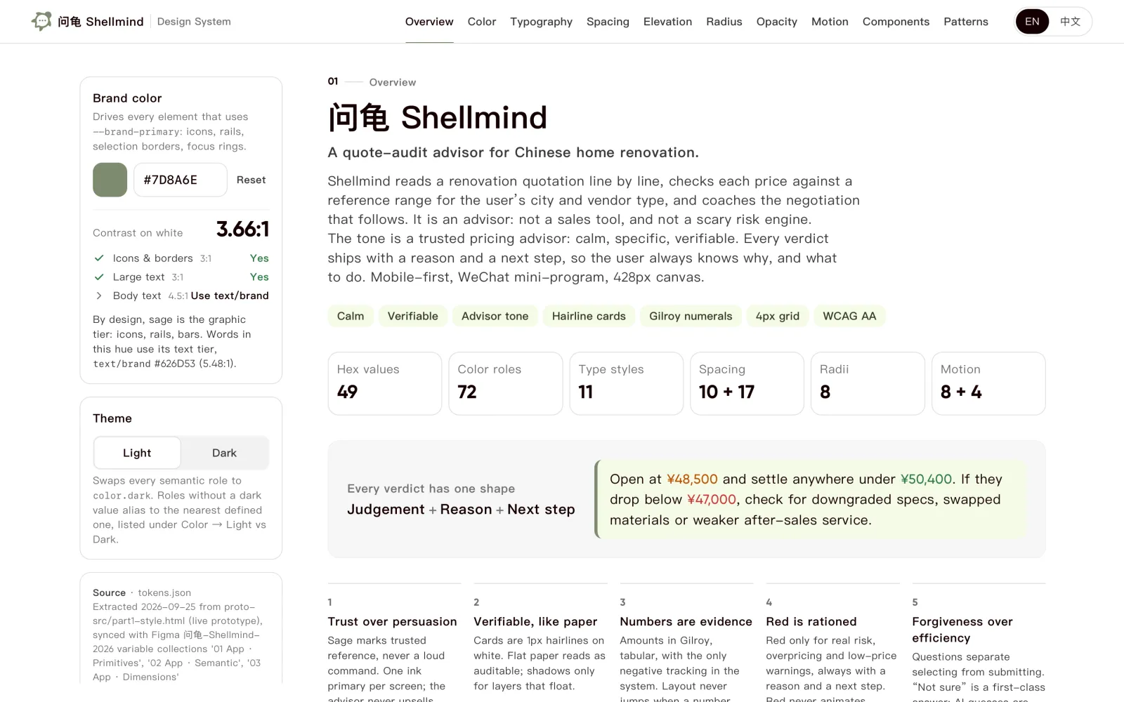
Tokens
Design system playground
49 hex values, 72 color roles, live contrast checks — pick a brand color and watch every role re-derive.
Components, every state
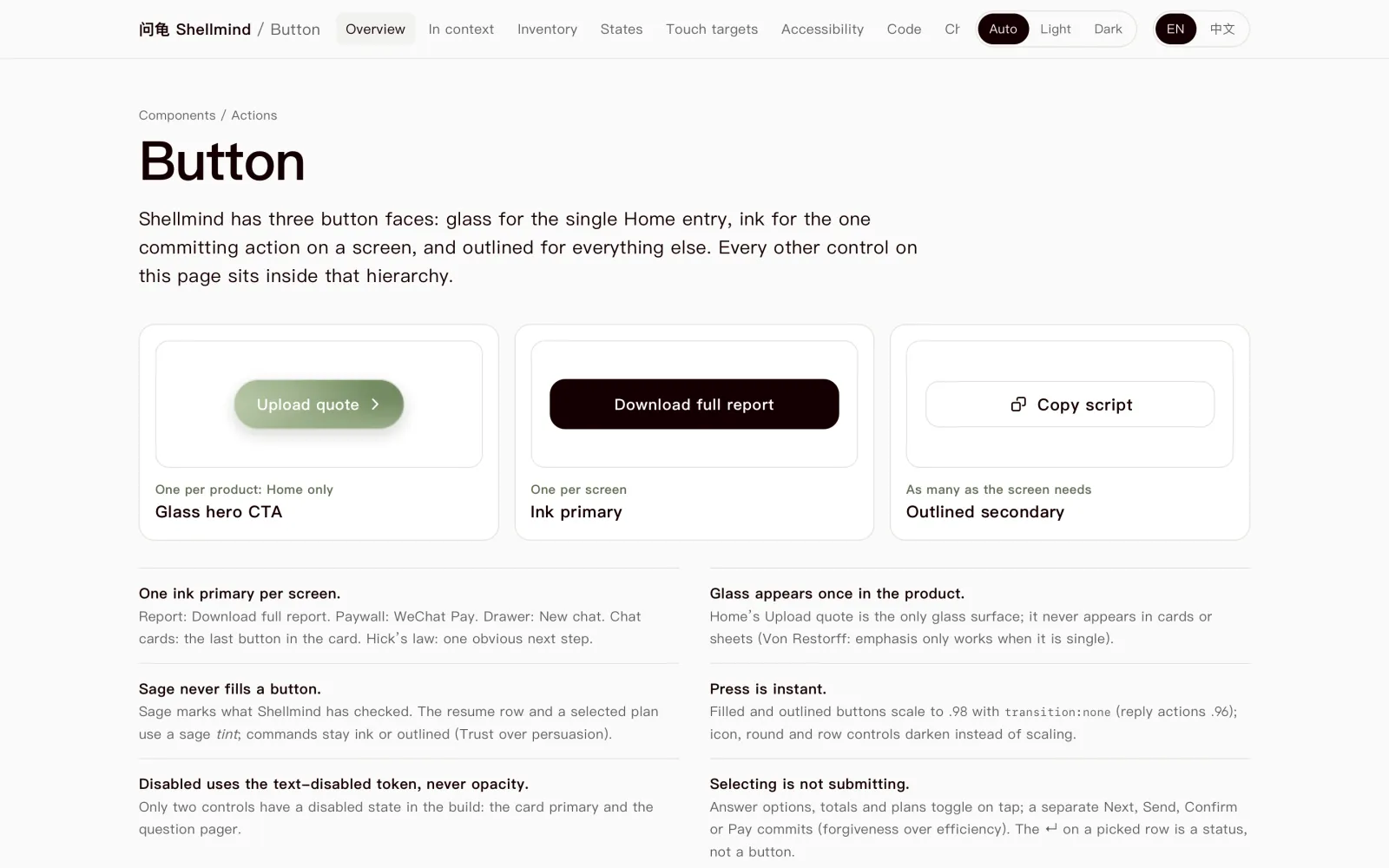
Button spec
Three faces — glass, ink, outlined — every state, and the rules written down beside them.
The working prototype
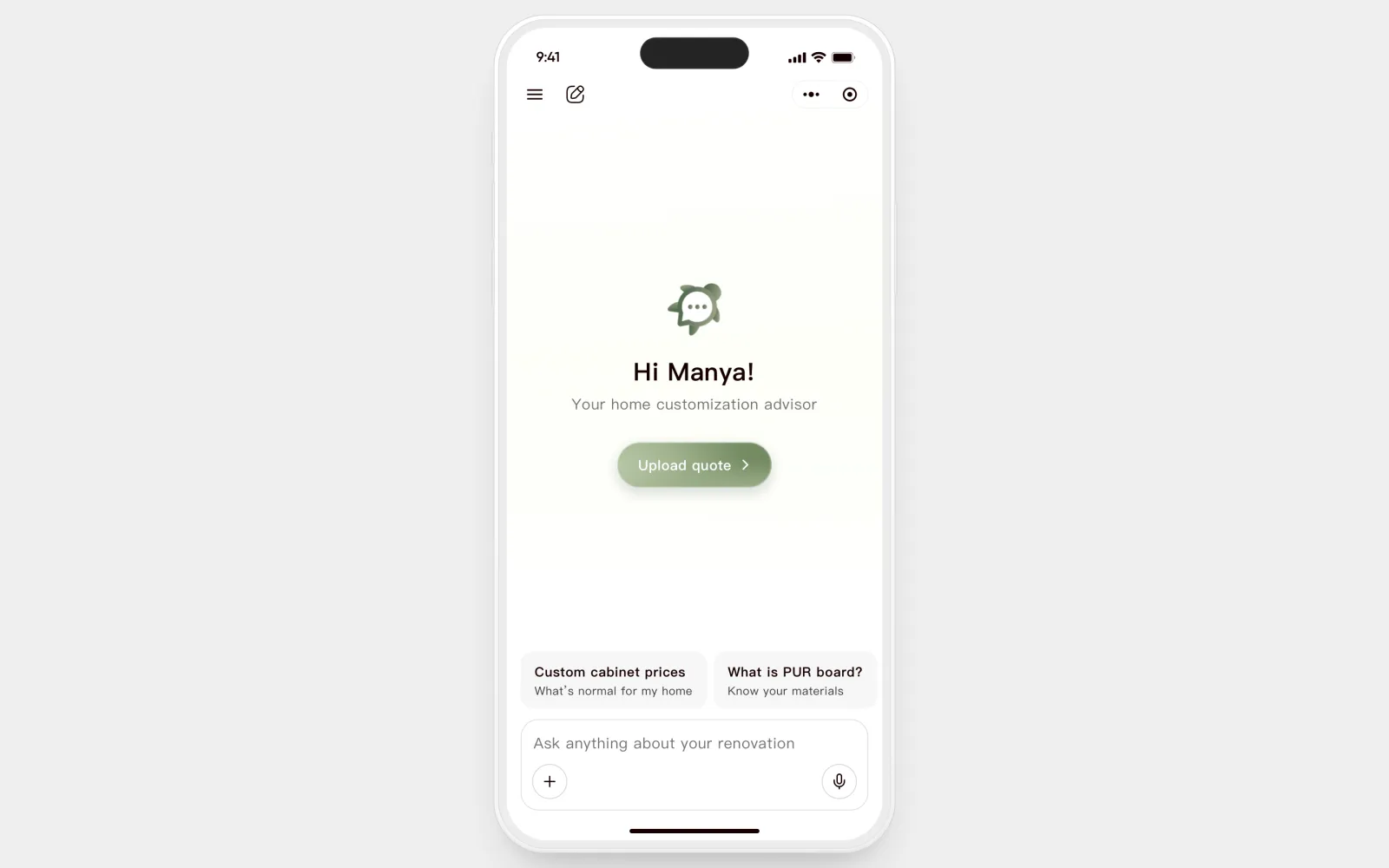
Coded prototype
The flow engineers clicked instead of reading: upload a quote, answer the mid-check questions, open the report.
05 · Impact
Three measures, because they answer three different questions
Reached the end of the core report path within one session.
In moderated sessions, could name a specific next step unprompted.
Drop-off before an action, read alongside events like copying a script.
Results for V2 as a whole — no single screen gets the credit. In its first 30 days V2 reached 4,690 organic users, contributing to a $700K seed round.
06 · Takeaways
My takeaways
1. Reframing the problem was the real design work
The brief said "make the report better." The real unit was the decision — and that call wasn't visual, it was definitional.
2. Every decision should name what it gives up
Saying the cost out loud, and how I'd know I was wrong, is what made my calls easy to back.
3. Design the moments between screens, not just the screens
People left between screens: before a quote, during an unsafe-feeling wait, after a report that stopped short of the next sentence.
What I'd do differently
- Measure what happens after people leave the app.
- Check time estimates against real runs, early.
- Watch the chat-to-upload rate from day one.
The AI is usually right. People still have to decide whether to trust it. That's the moment I love designing for.